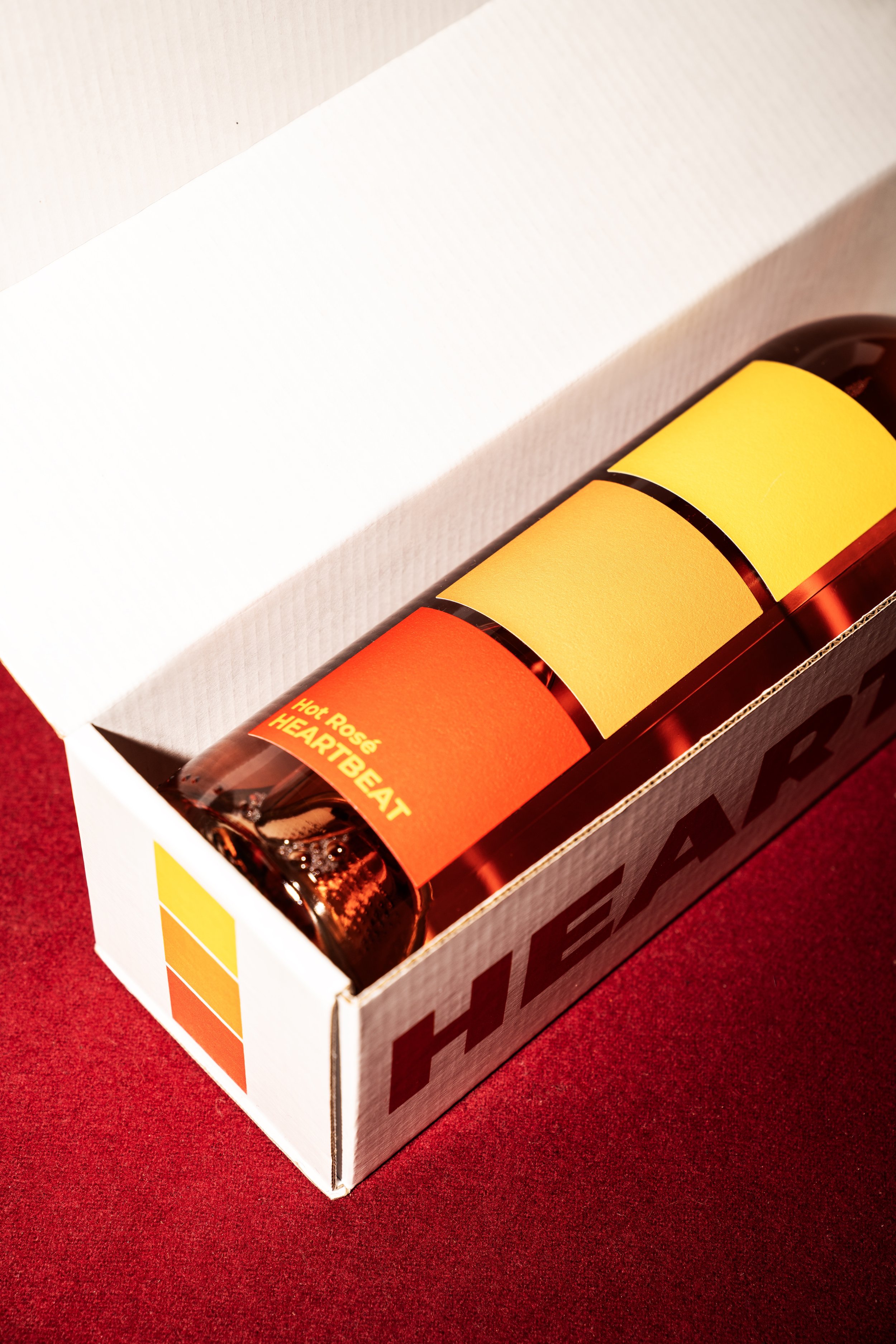
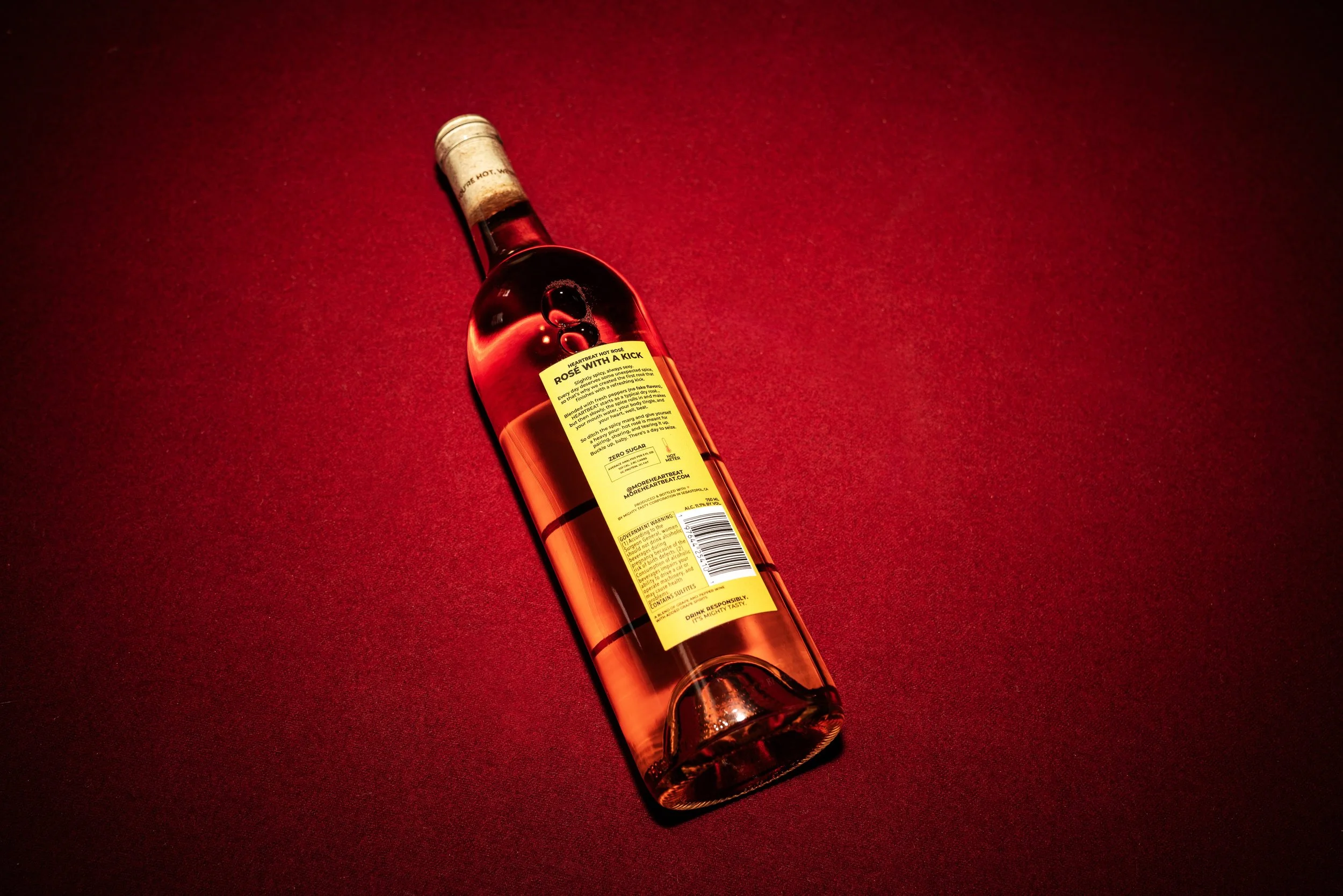
Heartbeat Hot Rosé reached out for some brand design. They’d developed a cool product of a habanero infused rosé and wanted something simple and loud for the design. We went through a lot of the stuff they had been exploring and we decided to take a step back and start at square one (literally) — because we started with color ideas in the form of Pantone squares. While looking at the squares, I thought it’d be cool if THAT was the design — three squares stacked on top of one another, laid out like a gradient to be reminiscent of a thermometer or a sunset. This way, we’d be able to convey the idea of the ‘heat’ that was inherent to the product.
Besides, going with a flame or heart icon just felt too predictable.
Role: Design, Copywriting
Rosé with a kick.
It’s the anti-rosé rosé. Because whether you’re a wine aficionado or not, this is a rosé that doesn’t taste or act like what you think it should.
TURNING TUESDAYS
INTO SATURDAYS


